Wednesday, March 27, 2013

Sally Hansen Complete Salon Manicure Spring Shades


The weather here has been so up and down that it's hard to believe it's already spring. Spring is traditionally the season of florals and pastels, so today I'm going to show you a selection of pinks and neutrals from the Sally Hansen Complete Salon Manicure line.
To give you a little bit of background information, this collection is described by Sally Hansen as a seven-in-one formula containing all seven steps of a manicure in one bottle: base coat, strengthener, growth treatment, color, top coat, gel shine and chip resistance. This is an enhanced formula, which previously contained the first five steps. Despite the fact that this polish has a base coat built in, I never paint my nails without using a separate base coat to protect them. I did photograph them below without top coat so you can see the natural application.

The best thing about these polishes, aside from the huge range of colors, is that they feature Sally Hansen's Precision Brush. This is a shorter, flatter brush than typically found in other lacquers, and according to Sally Hansen it contains an 800-bristle count. It's the perfect shape to apply even layers of polish close to your cuticles without flooding them. One thing to note, however, is that in a few of these bottles some of the bristles had formed jagged edges and made the application a little difficult and streaky. This happens a lot with some of my older polishes, so it's just something to look out for while picking out your polishes from the store.

Here are four swatches from the collection that are perfect for spring:


Rosy Outlook is a vibrant rose pink. It's a great pop of color in this season of blushes and soft hues and I think this would be ideal for floral print nail art. Pictured above is two coats; the application was easy and I got full opacity with just two coats. It dried well without any streaks, so I think this is a good "grab and go" polish if you're in a hurry and need to skip top coat. This is one of the new shades that was in the last batch of colors released, and I think it's a great addition.


Shell We Dance is a soft sheer blush. The color was so subtle that my camera just wasn't picking up  the right hue, but you can faintly see the pink tint in my second photo. Even with the three coats above, the color still appeared sheer. I wouldn't recommend using more than three coats though, as the polish was already starting to thicken. Even though it's not totally opaque, this is a great color and perfect if you're trying to follow the blush trend for the season.


Almost Almond is almost a fantastic polish, but stops just short of being awesome. it's a good neutral base, but something about the slight shimmer in the color makes it look slightly streaky in person. I think on some people this would look amazing — I'm thinking it'd be better on women with tanner skin — but for my skin tone it falls a little flat. 


For polishes like this, I wish I was able to splurge on a macro lens. Gilty Party is a truly gorgeous blend of microglitters in bronze, silver and gold. It's beautiful in person and has so much depth in the different metallic colors. Does it make a mess when you remove it? Absolutely. Is it worth it? 100 percent.

Of these polishes, Gilty Party was the biggest stand-out for me, simply because I haven't quite seen another polish like this one in stores. 

Sally Hansen Complete Salon Manicure polishes retail for $7.99 each at chain drug stores and mass retailers nationally. You can visit the webpage for the line to view all of the colors before stopping by a store.

Sally Hansen products in this post were provided for review. See my disclosure policy for additional information.

Monday, March 25, 2013

Blue Tip Graphic Design Nail Art

The name for this post is kind of boring, but I was really excited about how this design turned out. Annie, Wendy and I were reunited this weekend for a night of nail polish and the classic makeover movies, "Pretty Women" and "Clueless."

What was really exciting is that Annie tried out her first attempt at nail art on Saturday and it was very cute! The photos didn't turn out so well since I grabbed a shot on my phone, so I may post it on Instagram later this week. She chose to do a polka dot mani using Essie Mint Apple and OPI Alpine Snow.

Wendy went crazy with about five or six different colors, so I can't even start to tell you what she did. It looked awesome though, and she even did floral print nail art on her toes (which I'm not flexible enough to do).

For my nails, I wanted to make them look elaborate without investing a ton of time. I wasn't sure exactly what I was going to do, so I started with a neutral base of OPI Skulls & Glossbones. In case you haven't tried the polish, it's a smooth light gray that looks great on everyone I've seen it on.


I decided to use OPI Can't Find My Czechbook to add colorful tips, but didn't want the traditional block of color so I tried a new technique. Using a ripped piece of makeup wedge, I sponged color on the tips until it was opaque with a slightly softer edge than you get when freehanding or using tape. After that, I used striping brushes to draw swipes of black and white on each side of the nail.


Overall, it took me about 30 minutes counting the clean-up time, but I love the simple design and complementary colors. I did swatch Sally Hansen polishes over the weekend, so keep an eye on the blog this week for some reviews.

Thursday, March 21, 2013

OPI Nicki Minaj Chevron Stripe

I'm an unapologetic "Glee" fan, so every Thursday evening I catch the tail end of "American Idol" (I'm actually watching it right now). What I'm not, however, is a fan of Nicki Minaj (just a personal preference ... that voice), but when these OPI colors from the Nicki Minaj collection came out last year I fell in deep, deep love.

To this day, Fly is one of my absolute favorite polishes because of how smooth it applies and how rich the color is. For this mani, I wanted to use all of the colors from the collection, but only succeeded in using four.


 From left to right (base color): Fly, Did It On 'Em, Metallic 4 Life and Pink Friday.

Each of the colors shown is  done with two coats for full opacity. Did It On 'Em and Pink Friday needed a thicker coat than Fly and Metallic 4 Life because they were a little streaky.

I freehanded the chevron pattern on each nail (I'm too lazy to use tape most of the time). It's a little hard to see, but on my accent nail, I have a small crystal rhinestone.


I'll end this now as "American Idol" finishes and I've muted Ms. Minaj mid-rant about a girl named Amber. Swatches to come this weekend!

Wednesday, March 20, 2013

Sally Hansen Brown French Mani

Today I have a mani featuring some new polishes that I received for review from Sally Hansen (see my disclosure policy on press samples). I haven't had a chance to sit down and swatch them yet, but I couldn't wait to try them out. I won't go into detail on the polishes since I'll be reviewing them later this weekend, but I decided to do a quick French mani with a fun twist.

For my base I started with Commander in Chic from the Complete Salon Manicure line. I used two coats here to get full opacity in this creamy taupe brown color.


The tips were done using Sally Hansen Gilty Party, one of my favorite shades from this line. It has a lot of depth and flecks of gold, silver and bronze.


As I mentioned, later this weekend I'll have some swatches for you (Wendy will be done with dental school finals and we're planning a girls' nail polish night!), plus, tomorrow I'm putting up some fun nail art using colors from last year's OPI Nicki Minaj collection. Stay tuned!

Products in this post were provided for review. See my disclosure policy for information on press samples.

Tuesday, March 19, 2013

How to Build Your Own Nail Polish Display

As I mentioned yesterday, I spent the weekend working with my husband on building a new display for my OPI polishes since I outgrew the rack I was using. I'm still storing all of my minis and miscellaneous OPI polishes (duplicates and older colors), but all of the new and frequently used stuff is now on my five-shelf display.

I was going to use the bottom shelf for supplies, but ended up building a second display shelf for some of my frequently used miscellaneous polishes until I accumulate enough OPI polishes that I use on a regular basis. The rest of my stash is tucked away in my closet in my plastic Target drawers.

If you're interested in building your own inexpensive nail polish display (mine was less than $20!), I put together a lengthy tutorial, featuring some diagrams that the hubby created and used while building mine.

This post is kind of a long one, so read on after the photo for a tutorial! If you have any questions, email me at allison@glitterandglossnails.com or shoot me a message on Twitter @glitterglossluv—it's a long post with some crappy diagrams, so I'm happy to clarify wherever needed. 


DIY NAIL POLISH RACK/SHELF/DISPLAY

A four- to five-shelf nail polish display shelf. 

Capacity: 84 bottles on four shelves; 105 bottles on five shelves if you put one row directly on your existing surface (a table or bookshelf)

Time: Approximately 2-3 hours

Cost: Approximately $20 (varies depending on the type of fabric you buy).

Materials: 
  • If you have a bookcase, then great—if not, you can also take this shelf display and use it on a desk, table, dresser or even on top of a bookcase. The rack will end up being 8 inches tall and 10 inches deep. You can adjust the width depending on your own bookshelf or table.
  • An 18"x18"x16" Scotch Storage Box from Target ($4.79)
  • A thick roll of duct tape from Home Depot, 1.88 inches wide ($6.79)—any duct tape will work, but I recommend using one that's 1.88 inches wide so that it's almost as wide as each shelf.
  • One yard of fabric—I used an outdoor fabric because it was a heavier weight and therefore more durable; it was on clearance for $9/yard and applied a 25 percent off coupon. Try visiting your local fabric store and scouring the clearance rack. I would recommend using an outdoor fabric or even a flannel ... cottons, silks and organzas will be too lightweight, satins will be too slippery and fleeces/felts will be too heavy. ($6.75)
  • A sharp razor blade, box cutter or a knife 
  • Scissors
  • A 12-inch ruler
  • Measuring tape

Step One: Separating

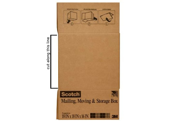
Using your scissors, cut the box apart along the pre-folded edges lengthwise on all four folds. You'll end up with four long pieces.


Step Two: Cutting

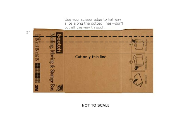
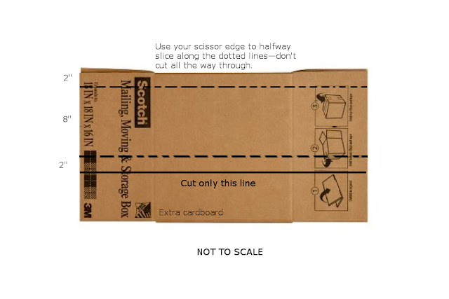
Set three of the cardboard pieces aside—you're going to make the 2-inch block first. Use your ruler to draw three dotted lines two inches apart. The fourth line will be a solid line, also two inches away from the one next to it.

On the dotted lines, you're going to use the scissor edge to slice halfway through the cardboard—don't cut all the way through though. The reason you're doing this is to create a crease so it's easier to fold.

On the fourth line (the solid one), use your box cutter to slice all the way through. Be sure to save the extra piece, as you'll need it later.
Repeat this step for the 4-inch and 6-inch boxes (see below for a guide, replacing the 4" for 6")
For the 8-inch box, you'll only be able to fit three sides of the box. Measure out an 8-inch piece from the first piece of cardboard—cut that piece and set it aside.

Next, you'll measure out the fourth cardboard piece according to the diagram below.
This is the time when you'll want to decide the width that you want your shelf to be. I decided mine was going to be 28.5 inches to fit in my bookshelf, but it's up to you. Use a measuring tape to mark off how wide your display should be and cut the excess from the long side of each piece of cardboard (each cardboard should be the same size when held lengthwise; the height should be the only thing that's different.)


Step Three: Reinforcement and Taping

When you're done, you'll end up with four rectangles similar to the one below on the left in my hubby's diagram.


You're going to create reinforcements so that the box doesn't collapse. In order to do this, you're going to cut several strips using the excess cardboard. Here's what you need: 
  • (3)  2" x 6" strips [for the 2" block]
  • (3) 2" x 8" strips [for the 4" block]
  • (4) 2" x 10" strips [for the 6" block]
  • (4) 2" x 12" strips [for the 8" block]
Basically, you're going to fold the two sides in by two inches and use duct tape to secure those flaps to the 2" sides of the box. Spread the reinforcements evenly throughout each block, making sure you have two of them close to the open ends (but not flush to the end). Don't be afraid to use a lot of tape!


When you're done, use duct tape to seal each box together. I only drew in one piece, but use duct tape all the way across the open end to seal it. You'll end up with four pieces like this:


Step Four: More Taping

This is where you get tape-crazy. Wrap each block with plenty of duct tape with the sticky side out (you need to stick them together). I also added additional pieces of inside-out duct tape stuck on all sides of the blocks. Pictured is a diagram of two, but you'll need to do this for all four blocks.

Once you're done, carefully attach the blocks together. The 8" block will be your base. Align the 6" block on top of it, making sure you have one flat edge when attaching them. The 4" block goes on top of that, followed by the 2" block. 


After the three pieces are attached, grab an extra piece of cardboard and secure it to the flat side with more duct tape—this will help stabilize the blocks and make the whole thing sturdier.


Step Five: Wrapping

Almost done!

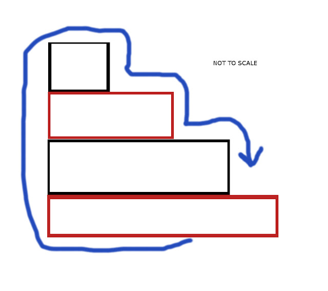
Lay your fabric out flat on a hard surface, with the patterned side face down. Tape the edge of the fabric to the bottom of the display (the 8" side) and begin to wrap the fabric around the back (the flat side). As you wrap it, make sure you're pulling it taut so that there aren't any creases or wrinkles as you press it onto the duct tape that you applied to the boxes in step four. Below is a rough sketch of what I did—the blue arrow is the fabric. Just make sure the patterned side of the fabric is facing out when you wrap! 

When you get back to the bottom of the display, use a few pieces of duct tape to secure it. Trim the excess from the sides, leaving at least two inches on each end so you can fold the ends in. Cut slits where necessary in the overhang so that you can fold it in; wrap the fabric inside the end of each block, using duct tape to secure.


That's it! Whew ... that was a long one. If you're lucky, you got this done in about 2-3 hours without too much of a headache. If you don't plan to put this inside of a bookshelf, you can make the ends look prettier by stuffing the hollow parts of the tube with some colored tissue paper.


If your bookshelf isn't very well-lit, you can also buy some battery-operated lights and stick them inside the shelves like I did—they were the As Seen On TV brand and I got three for $10. 


Good luck and enjoy!

Monday, March 18, 2013

St. Patrick's Day Nails 2013

I'm a day late on posting this, but I was busy all weekend helping my husband design my new OPI nail polish rack! Over the weekend, I put together nails for my least favorite holiday: St. Patrick's Day. I pretty much hate the color green, so it was hard for me to come up with something cute to do for St. Patrick's Day. For this mani, I used four OPI polishes, as well as one Sally Hansen nail color that was provided for review (see my disclosure policy for more information on press samples).

There's really not much to say about this one (and not much I want to say), so without further ado, here's my belated design:


On my accent nail, the top green is Don't Mess With OPI, followed by Green-Wich Village and Gargantuan Green Grape. The other nails are done with a base of OPI Alpine snow, with Green-Wich Village dots and Sally Hansen Gilty Party tips. The shamrocks were made with Don't Mess With OPI.


I'm not so enthused about these, but they turned out very festive. Unfortunately I didn't get a green beer, but maybe next year!

Some products in this post were provided for review. See disclosure policy for full details.

Thursday, March 14, 2013

Sally Hansen Insta-Dry Nail Color — Spring Shades

Today I'm swatching a few polishes from the Sally Hansen Insta-Dri Nail Color collection. These three are the newest colors in the line: Blue-Away, Fuchsia Flare and Peachy Breeze.

The most important thing to know when using these polishes is that Sally Hansen means business when they say "Insta-Dri." The minute the lacquer comes out of the bottle, the drying process begins. This is a great thing for people who get impatient, but you definitely need to move quickly during application or you end up with a goopy mess. It's not an ideal polish for nail art, but the quick drying time means that you can use it as a base and begin your nail art even sooner.


Blue-Away is a sky blue that leans toward the pastel side. It actually looks a bit lighter in the bottle than it does on the nail, but once applied it's a beautiful color. I wore this shade for less than 24 hours and got three different compliments on my nails. The formula is a bit streaky, but if you apply two coats and seal with a good top coat (I used Seche Vite), it has a really smooth and clean finish. Be sure that you wrap the tips—I missed the tip of my index finger and by the next day the polish had already started to chip off.


The formula for Fuchsia Flare was a little difficult to work with—it seemed to dry a little quicker than the other two for some reason. When applying, be sure that you get the excess polish off the brush so you don't pool it over the nail (it's even more important than normal to do this due to the thickness of the polish). The colorful is a bright, cheerful pink and you might be able to get away with one coat, if you polish carefully. I used two coats above and sealed it with a good top coat, so it smoothed out whatever streaks there were.


Peachy Breeze has a bit of a misleading name. I would consider this color more of a coral pink rather than peach, which I usually associate with more orange undertones. In the bottle, it looks like it's in the same color family as Fuchsia Flare, but on the nail it's actually softer and very feminine. Although the name doesn't quite fit, the color is great and very unique—I haven't seen a shade like this in a nail color in a while. The formula on this one was better than Fuchsia Flare, but definitely needs a top coat. As with all of these polishes, the brush has short bristles that lay flat for a thick stroke across the nail.

Overall, my favorite color of the three is Blue-Away for its unique sky blue color—it also had the best application of the three.

Sally Hansen polishes are $4.99 and can be purchased at drugstores and mass retailers nationally.


These products were provided for review.


Wednesday, March 13, 2013

Rainbow Gradient

I haven't seen "The Great and Powerful Oz" yet, but growing up "The Wizard of Oz" was my No. 1 favorite movie. C'mon ... it really has it all: flying monkeys, a wicked witch, talking inanimate objects, a man made of tin, beautiful pink dresses and ruby slippers.

Judy Garland's "Somewhere Over the Rainbow" was one of my favorite songs, so these nails are inspired by her awesome performance.


Here are the colors I used:

Pinky: Jessica Soak up the Sun (pink) and Sally Hansen Hollywood Scarlet (red)
Ring finger: Sally Hansen Hollywood Scarlet (red), OPI In My Back Pocket (orange), Sinful Colors Firefly (yellow
Middle finger: Sinful Colors Firefly (yellow), China Glaze Hanging in the Balance (blue); the green is a custom mix of these two colors
Index finger: China Glaze Hanging in the Balance (blue); lavender is a combination of OPI I Don't Give a Rotterdam, Jessica Soak up the Sun and OPI Alpine Snow; violet is a combination of Sally Hansen Hollywood Scarlet and and China Glaze Hanging in the Balance


My favorite combinations are the pink/red pinky and blue/purple index finger ... but they're all so colorful and cheerful that they brighten my mood.

Tuesday, March 12, 2013

Cool Shades Color Block

 I'm so in love with these colors that I don't even mind that my photos today turned out terrible. For this color-blocking manicure I started with a two coats of OPI Pamplona Purple (swatch below) and built from there. After my first color dried, I used striping tape to section off my nails to create a funky block pattern.

The teal blue is OPI Fly, which has a great opacity—for some of the blocks where I had a lighter application I needed two coats, but one thick coat also worked great. The white—beautiful, crisp white—is OPI Alpine Snow, looking brighter and better than ever.

Once the polish was mostly dry, I removed the striping tape and used my striping brush and black polish to draw the horizontal and vertical lines. So. In. Love.


Here's a swatch of Pamplna Purple. It's such a gorgeous, rich hue and applies really smoothly. Also, in the background, you'll notice a Band-Aid on my thumb—another kitchen mishap.


What do you think of the color combinations ... are you loving them as much as I am?

Monday, March 11, 2013

Balloon Nal Art

The moral of today's story is: Allison needs to not be lazy. And get new striping polish.

I saw some "Up" posters recently and wanted to do a cute balloon mani, and I got about halfway there. The balloons are a little sloppy, but workable; it's the darn strings that messed me up.

Anyway, I used several colors for this mani. The base is Essie Borrowed & Blue, which you all know is an awesome sky/pastel blue.


For the dark teal balloons, I used OPI Fly from the Nicki Minaj collection. It's actually one of my favorites and has a great application, though it looks a little grainy here. The orange balloons are done with OPI In My Back Pocket and the light green is OPI Gargantuan Green Grape. The pink, unfortunately, I don't have a name for because it's one of those old crusty polishes I dug up from the bottom of my stash.


To make the balloons, I used the large and small ends of a dotting tool ... that was the easy(-ish) part. I admit that I was getting lazy by this point, and tired of dealing with so many colors, so I whipped out my black striping polish rather than using a striping brush and regular blax polish.

The result was kind of disastrous. The polish had gotten clumpy since I last used it, so the application was incredibly uneven and the brush was impossible to control. The result was messy, misshapen strings that had no real rhyme or reason. At least the colors were cute?

Sunday, March 10, 2013

Tree Love

One of my best friends moved up to the Bay Area for college and when I went to visit her, there were trees. Everywhere. So Connie, if you ever read my blog, this one's for you.

I'm not an outdoors person by any means. I'm not even a "sit outside under a tree with a good book and enjoy the sun" kind of person. I enjoy working indoors, at a desk, with all the comforts that four solid walls and a ceiling provide me. This nail art is definitely inspired by my outdoorsy friends and husband, people that can spend all day outside and not want to immediately shower off all the dirt and germs that collect under your nails.


My base color was three coats of OPI Funny Bunny—it actually applied a bit more sheer than usual, so I must have used lighter layers this time. The tree trunk was done with the same mix of Sinful Colors Black on Black and China Glaza Mahogany Magic that I used for my pizza nails yesterday, though today it came out darker because I upped the ratio of black to brown. I used a striping brush to apply the trunks and randomly placed branches (I think the middle finger turned out the best).

With a dotting tool, I added leaves of Don't Mess With OPI. Once those were dry, I went over them with a smaller dotting tool using OPI Green-Wich Village to add some dimension—I think the two colors go really well together.


Although I'm not a tree-hugger, I think this is easy nail art that anyone can accomplish.

Saturday, March 9, 2013

Pizza Nails

I have pizza on the brain. I'm working on an article about pizza for my job, so every day for the last week I've had this huge craving for pizza. I sent the hubby to Z Pizza earlier this week for a pear gorgonzola rustica pizza (which was beyond delish, by the way), but right now I just can't get enough of it.

So, of course I decided the best way to get it out of my system was to do some nail art. My all-time favorite pizza since I was a kid has been pepperoni, black olives and mushrooms (I know, kind of a gross combo, but soooo good). Since I don't have the right colors for mushrooms, I decided to swap them out for green peppers to add some contrast.


I started with a neutral base of OPI My Vampire is Buff, but even with its yellow tint it wasn't quite the right color. I layered it with a light coat of OPI Up Front & Personal, which is a shimmery sheer gold that added just the right amount of sparkle and pizzazz. It's not quite the yellow of oily, greasy cheese, but I'm not a yellow person so this is actually better. Using a dotting tool, I added uneven dollops of Sally Hansen Hollywood Scarlet for the sauce. For the crust, I mixed a dab of Sinful Colors Black on Black with China Glaze Mahogany Magic to make this muddy brown and applied it with a striping brush. this part was a bit messy, so I ended up having to do a lot of clean-up.

My topics consist of OPI Big Apple Red pepperonis (applied with a large dotting tool), Don't Mess With OPI green peppers and Sinful Colors Black on Black olive pieces.


It doesn't quite make me hungry looking at them, but I was pretty happy with how they turned out. An ode to pizza is enough to make any girl smile.

HTML/JavaScript